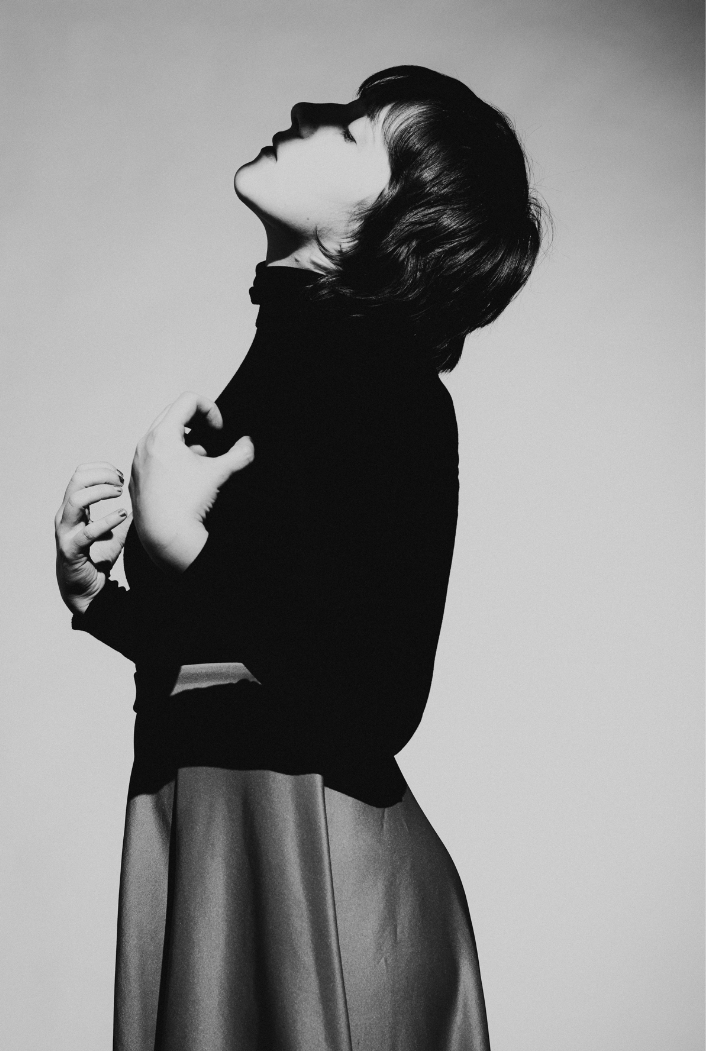
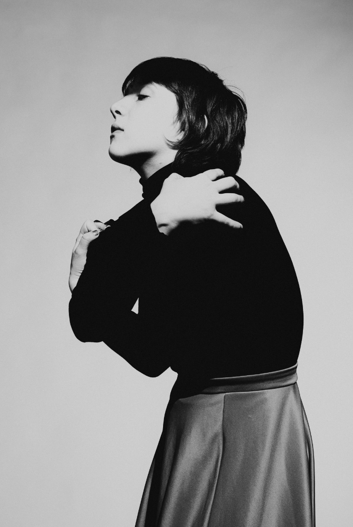
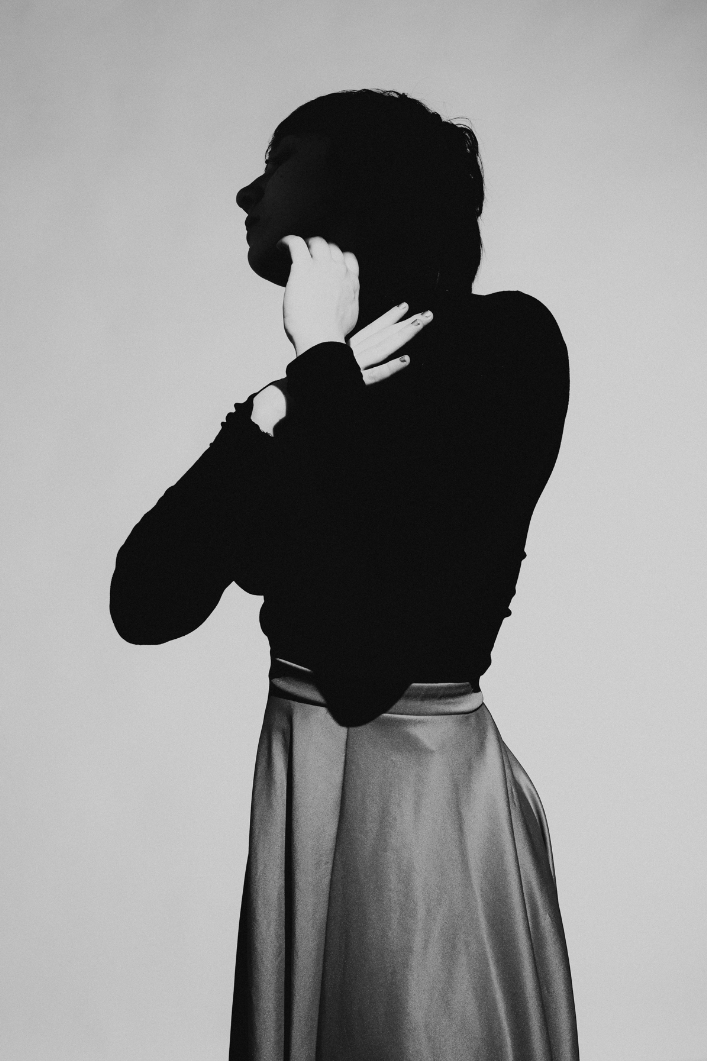
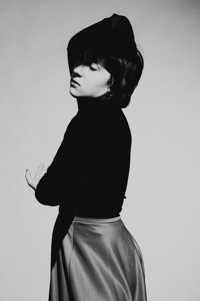
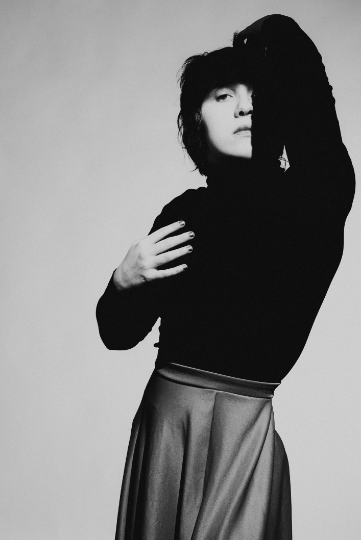
This was my first shoot with Annika Peterson and we did all the things. I started off with some light lighting, using a black fiber optic brush and orange gel from Light Painting Brushes. After that I explored making long exposures while rotating a linear prism FX filter and multi-strobing my flash. Finally, I took some shots with my fungus-filled lens, using shutter drag and an LED with changing colors.
Read MoreThis is Water
For decades I’ve adored 4AD album art from the 80s and 90s. The genius team behind the photography and design was Nigel Grierson and Vaughan Oliver, who operated under the name 23 Envelope. They were responsible for iconic album art of This Mortal Coil, Cocteau Twins, Dead Can Dance, The Pixies, and many more. Over the years I’ve tried over and over again to mimic some of the effects that I saw used in their photography, but my experiments always came up short. Much to my delight, my latest photographic exploration is the closest to their aesthetic, by far…
Read MoreElegance of Form
Bold Black and White Fashion Story with Molly
Ryan Bingham X Easyriders Magazine
Back in February I had the opportunity to shoot this video of Ryan Bingham for Easyriders magazine. I’m super proud of this piece, which I also co-wrote, directed, and edited. Big thank you to everyone who made it happen:
Read MoreShadows and Simplicity
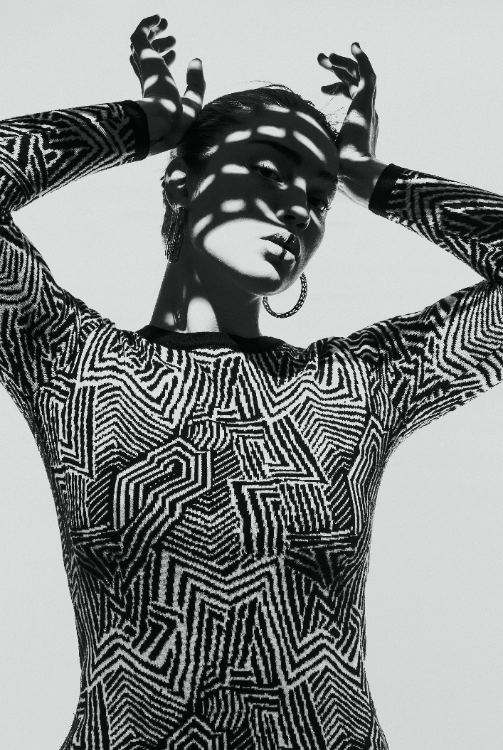
I love the brutality of hard light. Especially when used with a high contrast black and white treatment. Subjects emerge or recede into darkness. Features that might otherwise be missed are accentuated. Everything is stripped down to shapes. All too often I overcomplicate my setups and run the risk of missing the essence of my subject. When I can make myself slow down and simplify, that seems to be where I mot often find truth.
Read MoreTrash Talk
These images were created during sessions with three different models. I love the variation between each of them. The textures are just so stunning. I can’t decide whether I like this series better in black and white or color. I suppose it could also work to go back and forth. Thoughts?
Read MoreFinding Inspiration at the Hardware Store
Over the past year I’ve been pushing my images into more abstract, painterly directions. As digital images seem to be moving into a realm of hyperrealism, I find myself longing for gritty tangibility. Since I have always more in the get-it-in-camera camp, I have been experimenting with a range of techniques and materials to try and achieve the look I’m after. I started off this past spring by adding substances such as coconut oil and honey to glass and then shooting through it. After that I moved on to shooting with imperfect, fungus-covered lenses to get a hazy, dreamlike quality. Next I tried my hand at capturing distorted reflections in mylar. Most recently I explored what broken mirrors can add to an image.
All these experiments have worked together to inform my process in terms of optimal focal length, aperture, and light quality/direction when working with multiple planes, layers, and reflections. Now that I better understand how to manipulate these mediums I can walk through a hardware store, for example, and visualize how certain materials would look when photographed and lit a certain way, which is exactly what I did last week…
Read MoreRemembering My Roots with Kate Sweeney
Kate Sweeney is a powerful voice in contemporary photography, who just so happens to live in my neck of the woods. She always brings so much to both sides of the camera. I’ve been fortunate to have collaborated with her a few times now, and it’s always a great time of swapping industry stories or talking about who has been inspiring us lately before moving on to making some new art of our own…
Read MoreCharacter
I decided to keep this session really minimal. One light and a v-flat (which I used as a tabletop). Sarah brought a range of clothing options but I decided just to use the black and white options. I had her pull her hair back to keep all of the lines really clean and simple. It’s never not surprising to me just how much the mood of an image can change through a subtle gesture or tilt of the head.
Read MoreDiamond Hill for Barron's
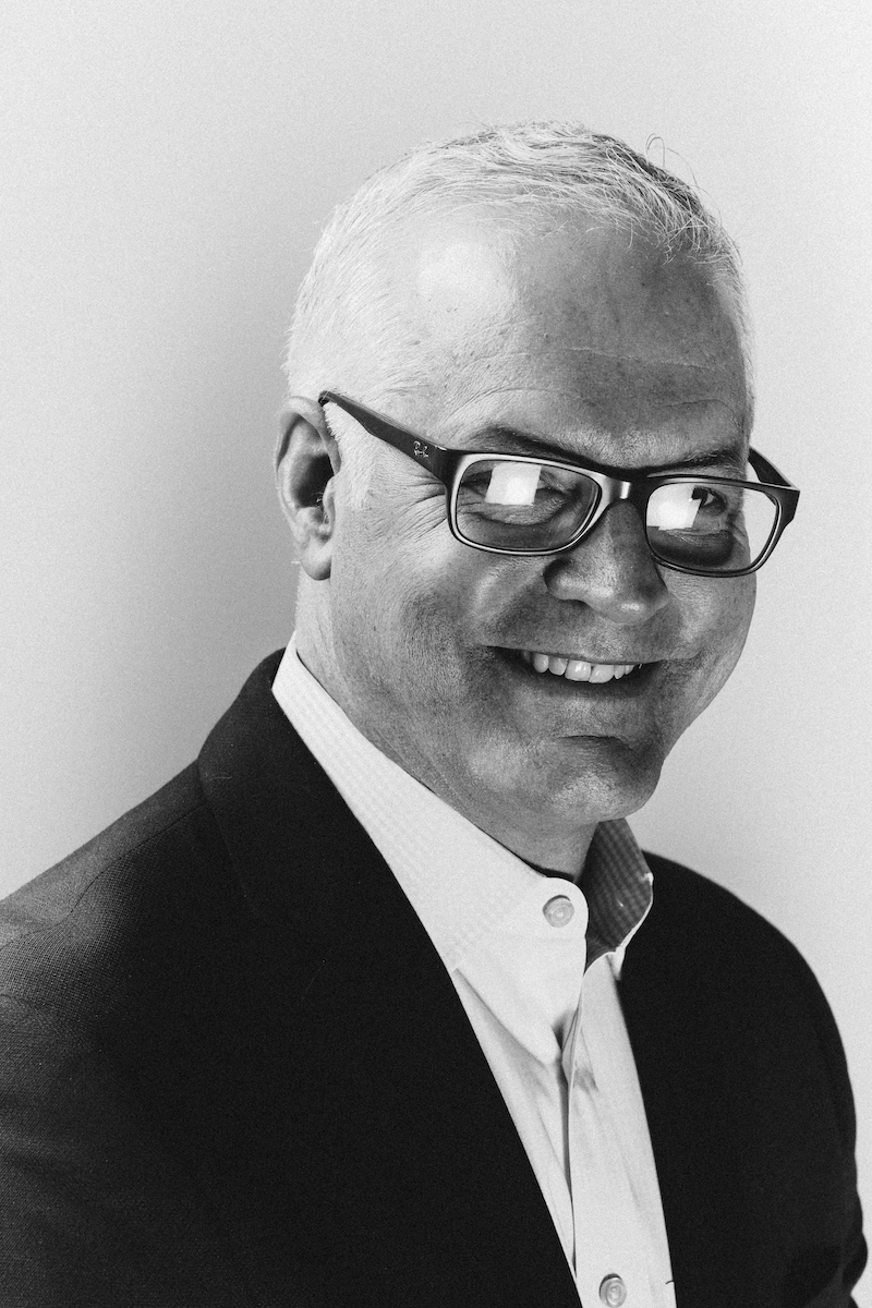
Last week I photographed Chris Bingaman, the CEO of Diamond Hill investment management firm, for Barron’s magazine. I shot a range of color scenarios but both Annie Chia (the DoP) and I agreed that the black and white conversions were the stronger images.
Read MoreSlow Hands
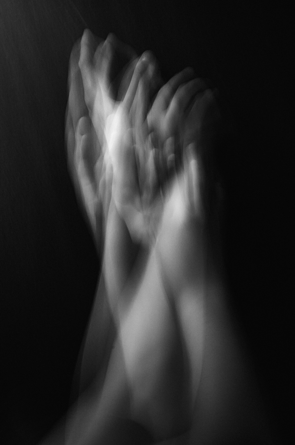
In my shoots I aspire to capture something beyond the outer appearance of my subject, and yet it can be quite hard to look past the specifics of a subjects appearance to get a glimpse of their soul. This is why I like to photograph hands. Not only do I find hands to be as expressive as faces, but they come with the added bonus of not being about any one person in particular. They are more universal in that way. As a viewer, you can more easily put yourself in the image, connecting the struggle or aspirations of a gesture.
Read MoreMerrill Lynch Atlanta for Barron's / Wall Street Journal
I can think of no better element in a photo shoot than creative freedom and trust. I had precisely that in my shoot for Barron’s last week in Atlanta. Annie Chia, the photo director, sent me a handful of photos of music groups such as Nirvana, The Rolling Stones, and the Velvet Underground as direction for my session with the three investments consultants. The shoot was already off to a great start.
Read MoreYin & Yang
Here are a few portrait studies that I’ve shot this past week. I’ve really been into shadow and subtlety of light/pose lately (and apparently black and white). I am largely known for my bold use of color, but creating quiet, muted moments is just as important to me as a visual artist— the yin as opposed to the yang.


